css3新增的属性
作者:互联网
1、边框
border-radius
box-shadow
border-image  可以有多张背景图
border-image:url('..'),url('kkk')
2、背景
background-size
background-origin

background-origin 属性规定背景图片的定位区域。

背景图片可以放置于 content-box、padding-box 或 border-box 区域。

背景图片的定位区域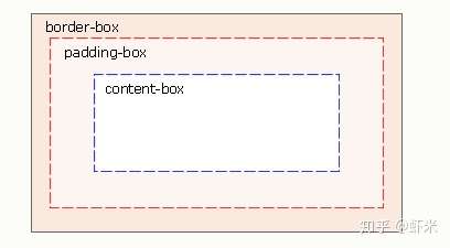
3、文本效果
text-shadow
word-wrap
word-wrap 属性允许您允许文本强制文本进行换行 - 即使这意味着会对单词进行拆分
4、@font-face
<style>
@font-face
{
font-family: myFirstFont;---------------------
src: url('Sansation_Light.ttf'),
     url('Sansation_Light.eot'); /* IE9+ */
}

div
{
font-family:myFirstFont;  和上面的一样
}
</style>
5、 CSS3 2D
移动 translate(2,2) 沿着 X 和 Y 轴移动元素
缩放 scale(2,4) 原来宽度的2倍,高度的4倍
转动 rotate(90deg)
翻转 skew(xdeg,ydeg)
6、CSS3 3D 转换 ,沿着某个轴旋转
rotateX()
rotateY()
rotateZ()
7、过渡 transition
transition:css的属性 过渡需要的时间  过渡所需的时间曲线 过渡时间何时开始

div
{
transition: width 1s linear 2s;
/* Firefox 4 */
-moz-transition:width 1s linear 2s;
/* Safari and Chrome */
-webkit-transition:width 1s linear 2s;
/* Opera */
-o-transition:width 1s linear 2s;
}
8、动画 animation @keyframes
div
{
animation: myfirst 5s;
-moz-animation: myfirst 5s;	/* Firefox */
-webkit-animation: myfirst 5s;	/* Safari 和 Chrome */
-o-animation: myfirst 5s;	/* Opera */
}

.div1{
animation: myfirst 5s linear 2s infinite alternate;
}

@keyframes myfirst
{
0%   {background: red;}
25%  {background: yellow;}
50%  {background: blue;}
100% {background: green;}
}标签:css3,myfirst,transition,新增,5s,animation,background,2s,属性 来源: https://www.cnblogs.com/coderwhytop/p/14751621.html