【快应用】text组件里的文字很多,旁边的div样式会被拉伸如何解决
作者:互联网
【现象描述】
当text组件的内容较多多行显示的时候,相邻的div样式会显示异常,会从正常的圆形变为椭圆。
代码如下:
<template>

  <div class="container">

    <div style="align-items: center;">

       <div class="typscolor" style="background-color: blue; opacity: 0.26; margin-left: 16px;"></div>

      <text>{{text}}</text>

       <div class="typscolor" style="background-color: blue; opacity: 0.26; margin-left: 16px;"></div>

      <text>{{text}}</text>

       <div class="typscolor" style="background-color: blue; opacity: 0.26; margin-left: 16px;"></div>

      <text>{{text}}</text>

    </div>

  </div>

</template>

<style>

  .container {

    flex-direction: column;

    justify-content: center;

    height: 100%;

  }

   text {

    font-size: 24px;

  }

  .typscolor {

      border-radius: 50%;

      width: 30px;

      height: 30px;

      background-color: red;

      margin-right: 8px;

  }

</style>

<script>

  module.exports = {

    data: {

      text:'text文本内容过多时左边的圆圈会被拉伸'

    },

    onInit() {

    },

  }

</script>
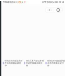
如图所示
异常
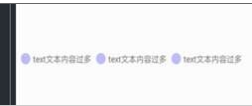
正常
【问题分析】
当text组件内容过多时,flex布局的时候宽度超出会自动压缩,从而导致div标签被拉伸了
【解决方法】
可以给div标签设置flex-shrink: 0属性,即可解决该问题
示例代码如下:
<template>
<div class="container">
<div style="align-items: center;">
<div class="typscolor" style="background-color: blue; opacity: 0.26; margin-left: 16px;"></div>
<text>{{text}}</text>
<div class="typscolor" style="background-color: blue; opacity: 0.26; margin-left: 16px;"></div>
<text>{{text}}</text>
<div class="typscolor" style="background-color: blue; opacity: 0.26; margin-left: 16px;"></div>
<text>{{text}}</text>
</div>
</div>
</template>
<style>
.container {
flex-direction: column;
justify-content: center;
height: 100%;
}
text {
font-size: 24px;
}
.typscolor {
border-radius: 50%;
width: 30px;
height: 30px;
background-color: red;
margin-right: 8px;
flex-shrink: 0; /*加上该属性即可解决拉伸问题*/
}
</style>
<script>
module.exports = {
data: {
text:'text文本内容过多时左边的圆圈会被拉伸'
},
onInit() {
},
}
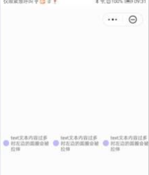
</script>如图所示:
欲了解更多详情,请参见:
华为官网:
https://developer.huawei.com/consumer/cn/forum/topic/0203908673278080243?fid=23?ha_source=zzh
标签:flex,拉伸,text,height,div,30px 来源: https://www.cnblogs.com/developer-huawei/p/16433308.html